


 | Your Junk my Happy Zone | |
| by Brandon Corbett |
With Carl out of commission with strep, I figure I will try my hand at one of his Coffee Time rankings efforts. Then once it is done and after you have read it, you can wish even harder for his speedy recovery! In the last two weeks Carl has done top 5 pitchers and hitters lists, as well as power rankings. So, what does that leave us to rank? Best deliveries? Top 5 trip and falls? Best facial hair... and its impact on the game? How about just "best looks?"
If you have ever been to the Teams or the Standings pages, then you will notice we have a very colorful league: a wide-spread assortment of team colors. As far as this article is concerned I wish I could concentrate on teams' on-field looks, i.e. jerseys, but with only three teams having them (Squirrels, Warriors, and DeLoppes) that is next to impossible. So, take two: I will go with ranking teams' look and style as a whole. Jerseyed team will get top billing, and I will lead up to those by giving the rest love, or hate, based on their logos alone.
8. Git r' Done
I don't even know what this is. Obviously it's a face traveling blazingly fast with a backwards hat on, but is it a face on a wiffleball? Or just some mustachioed guy? A faced wiffleball could be a good nod to Dennis Pearson, if that is what it is. Really, it looks like a window or bumper sticker you see on early 90s half-rusted out trucks: not really an image that shouts "wiffle." Git r' Done also lose style points for the bulk of their roster wearing blue Carlson Marauders gear when they listed their team color as red in the beginning of the year. What is this? Amateur hour? (That's for you, Carl!)
7. Campus Commandos

Not a bad logo, per se, but the fact that is actually the company's logo hurts its rank. (No offense, Adam: I just hate "sponsorship" of teams. :P). I will give a nod to the coincidence that the Commandos use the jungle camouflage greens and play at a field nicknamed the Jungle. So, there are some style points thrown in for that!
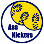
6. Ass Kickers

To be fair, it is not really fair to rank or critique this logo. This is one of the logos made to temporarily fill in, but was never replaced with a submission from the team. Still, an ass kicking boot on a ball diamond isn't a terrible identity, just kind of... unimpressive overall. To improve on it there is also this more "amusing, wiffle attitude" alternate: boot prints wiffling an ass!
5. Jason Mattseals

This logo is just awesome. A seal balancing a wiffleball, about to swing a wiffle bat, in kelley green and royal blue: this is a "wiffle attitude" logo if there ever was one. Full disclosure: this logo is an altered California Golden Seals logo, but that doesn't take anything away from the amusement it provides. It also pretty much perfectly illustrates the on-field personality of the Mattseals.
4. Belgian Wiffles
What can I say? It's a waffle that's wiffled! With butter! Probably the best primary logo in the league: its simplicity is what makes this a home run. Funny story: it almost never got used. Okay, not a funny story... or even much of a story, really. Captain Buhr had commissioned a jersey and new logo back in March, but it was aborted, abandoned, never completed, etc. Now, though, we can all take solace in that even though the jerseys never made it to the field, at least this gem of a logo got to stay.
Finally, uniformity!
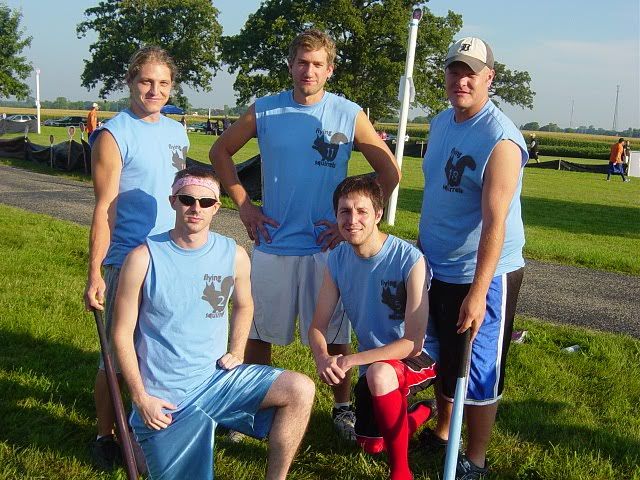
3. Flying Squirrels

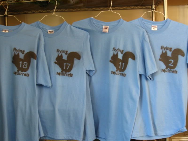
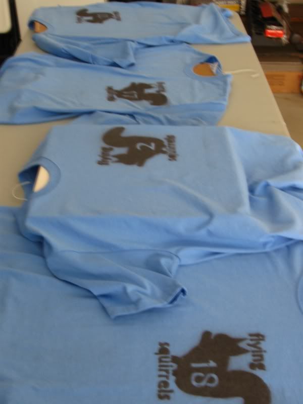
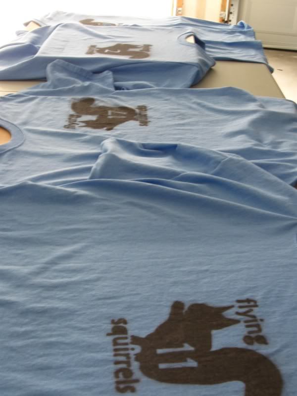
Simple, fun design that works well for a wiffleball team; anything but serious. Still, the 2011 jerseys are a step or two down from the 2010 design. The varsity block numbers on back lose the squirreliness of the old ones and just look generically bland. Also, the small number embedded in the chest logo was an immensely cool feature to lose. The acorns are a nice, whimsical touch, but don't make up the difference.
2. Wiffling DeLoppes

Home whites and road greys! How does a team with home and road sets not get the top spot? Simple. This is just not a good logo; especially for wiffleball. The logo switch made in mid-June looks like something you wake up with on a friend of a friends' floor after stumbling drunk into a tattoo parlor at 4am. I get that it is supposed to be reminiscent of the Tigers' old-English D, but it doesn't get the job done. A huge downgrade from the minimalist ball and bat they started the season with; "MMA/ghetto fabulous" does not work as a wiffleball look. The Squirrels have a superior logo design, but the multiple jerseys and their quality give the DeLoppes the push to beat them out. The simplicity of the jersey design is wonderful, and it is a huge relief that the colored side panels from early prototypes were left on the cutting room floor for the final design.
1. Westside Warriors
If you have ever been to the Teams or the Standings pages, then you will notice we have a very colorful league: a wide-spread assortment of team colors. As far as this article is concerned I wish I could concentrate on teams' on-field looks, i.e. jerseys, but with only three teams having them (Squirrels, Warriors, and DeLoppes) that is next to impossible. So, take two: I will go with ranking teams' look and style as a whole. Jerseyed team will get top billing, and I will lead up to those by giving the rest love, or hate, based on their logos alone.
8. Git r' Done
I don't even know what this is. Obviously it's a face traveling blazingly fast with a backwards hat on, but is it a face on a wiffleball? Or just some mustachioed guy? A faced wiffleball could be a good nod to Dennis Pearson, if that is what it is. Really, it looks like a window or bumper sticker you see on early 90s half-rusted out trucks: not really an image that shouts "wiffle." Git r' Done also lose style points for the bulk of their roster wearing blue Carlson Marauders gear when they listed their team color as red in the beginning of the year. What is this? Amateur hour? (That's for you, Carl!)
7. Campus Commandos
Not a bad logo, per se, but the fact that is actually the company's logo hurts its rank. (No offense, Adam: I just hate "sponsorship" of teams. :P). I will give a nod to the coincidence that the Commandos use the jungle camouflage greens and play at a field nicknamed the Jungle. So, there are some style points thrown in for that!
6. Ass Kickers
To be fair, it is not really fair to rank or critique this logo. This is one of the logos made to temporarily fill in, but was never replaced with a submission from the team. Still, an ass kicking boot on a ball diamond isn't a terrible identity, just kind of... unimpressive overall. To improve on it there is also this more "amusing, wiffle attitude" alternate: boot prints wiffling an ass!
5. Jason Mattseals
This logo is just awesome. A seal balancing a wiffleball, about to swing a wiffle bat, in kelley green and royal blue: this is a "wiffle attitude" logo if there ever was one. Full disclosure: this logo is an altered California Golden Seals logo, but that doesn't take anything away from the amusement it provides. It also pretty much perfectly illustrates the on-field personality of the Mattseals.
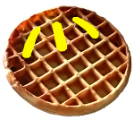
4. Belgian Wiffles
What can I say? It's a waffle that's wiffled! With butter! Probably the best primary logo in the league: its simplicity is what makes this a home run. Funny story: it almost never got used. Okay, not a funny story... or even much of a story, really. Captain Buhr had commissioned a jersey and new logo back in March, but it was aborted, abandoned, never completed, etc. Now, though, we can all take solace in that even though the jerseys never made it to the field, at least this gem of a logo got to stay.
Finally, uniformity!
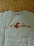
3. Flying Squirrels
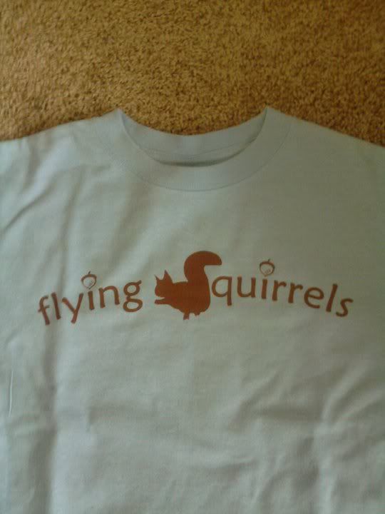
Simple, fun design that works well for a wiffleball team; anything but serious. Still, the 2011 jerseys are a step or two down from the 2010 design. The varsity block numbers on back lose the squirreliness of the old ones and just look generically bland. Also, the small number embedded in the chest logo was an immensely cool feature to lose. The acorns are a nice, whimsical touch, but don't make up the difference.
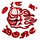
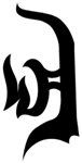
2. Wiffling DeLoppes
Home whites and road greys! How does a team with home and road sets not get the top spot? Simple. This is just not a good logo; especially for wiffleball. The logo switch made in mid-June looks like something you wake up with on a friend of a friends' floor after stumbling drunk into a tattoo parlor at 4am. I get that it is supposed to be reminiscent of the Tigers' old-English D, but it doesn't get the job done. A huge downgrade from the minimalist ball and bat they started the season with; "MMA/ghetto fabulous" does not work as a wiffleball look. The Squirrels have a superior logo design, but the multiple jerseys and their quality give the DeLoppes the push to beat them out. The simplicity of the jersey design is wonderful, and it is a huge relief that the colored side panels from early prototypes were left on the cutting room floor for the final design.
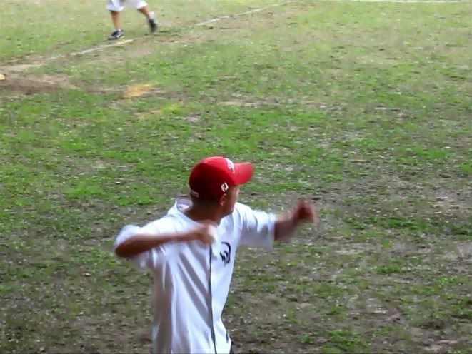
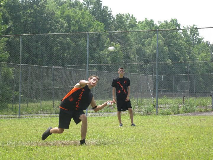
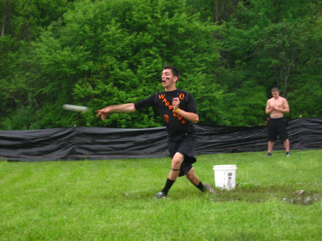
1. Westside Warriors


Great hockey style layout. The black and orange pops and stands out distinctively: the guys most often tend to match fairly uniform black shorts, too. Not even the random grey piping ruins the look, which is really surprising since I hate random piping and garish side panels (looking at you early 2011 DeLoppes white jerseys). The Native American's head logo is dignified and steady, not trying to be anything more than it is; it is a logo that just exudes confidence.
Well then, what have we learned about proper wiffle design? Obviously, trying to be more "badass" falls flat on its face. Humor and silliness tend to capture that "kid's game played in a backyard" atmosphere of the game. As always, there is also something to be given to understatement. The main thing I am coming away with, though, (and hope you do, too!) is that more teams need jerseys for next year!
No comments:
Post a Comment
Please, sign your name to your comments.